October 03, 2021
Quranly App Redesign
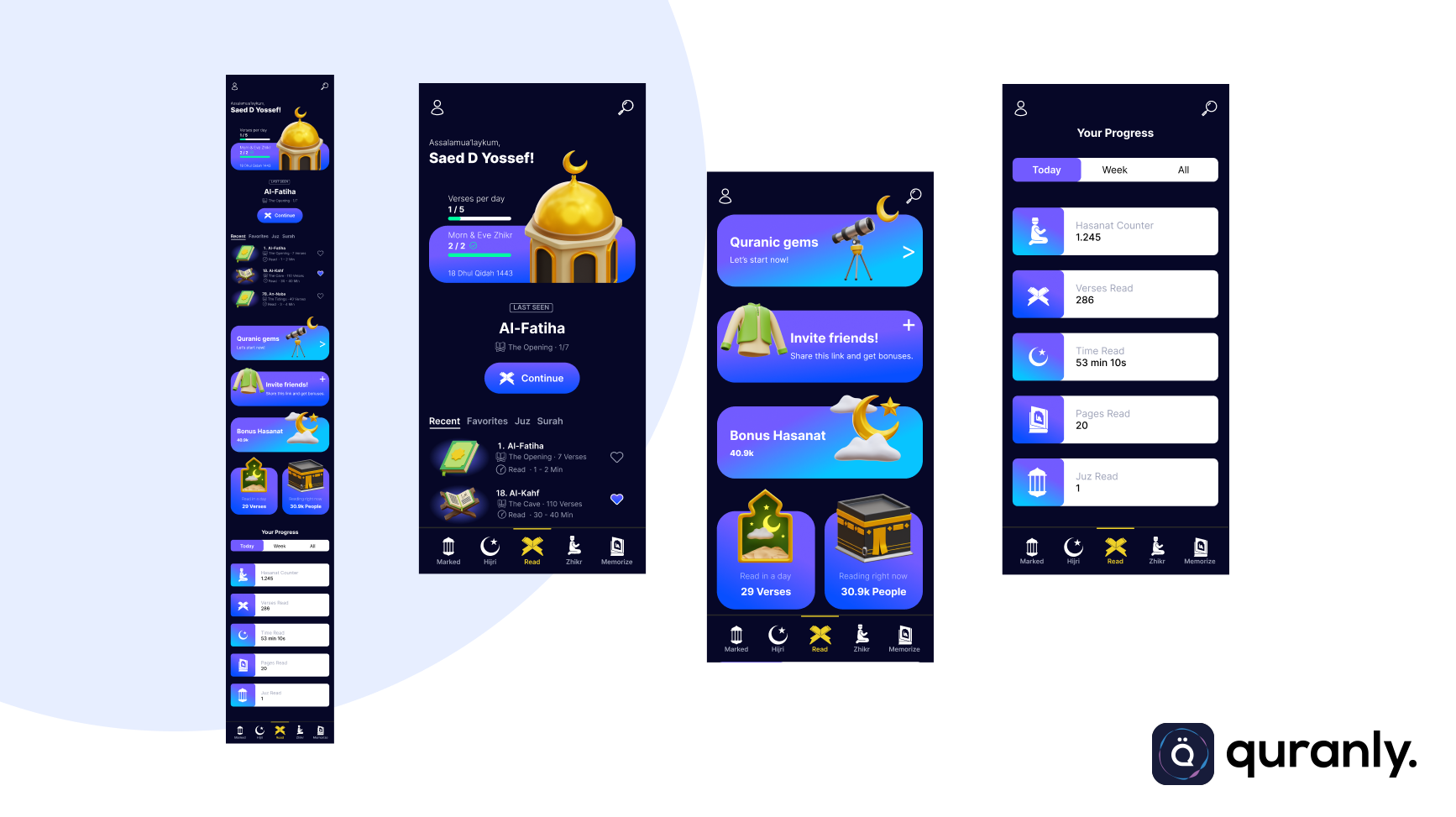
This is a case study of the redesign process for reading & education app platform name Quranly.
Client
Quranly
Project
App Redesign
Website
QURANLY
QURANLY
REDESIGN
REDESIGN
Intro
The Problems
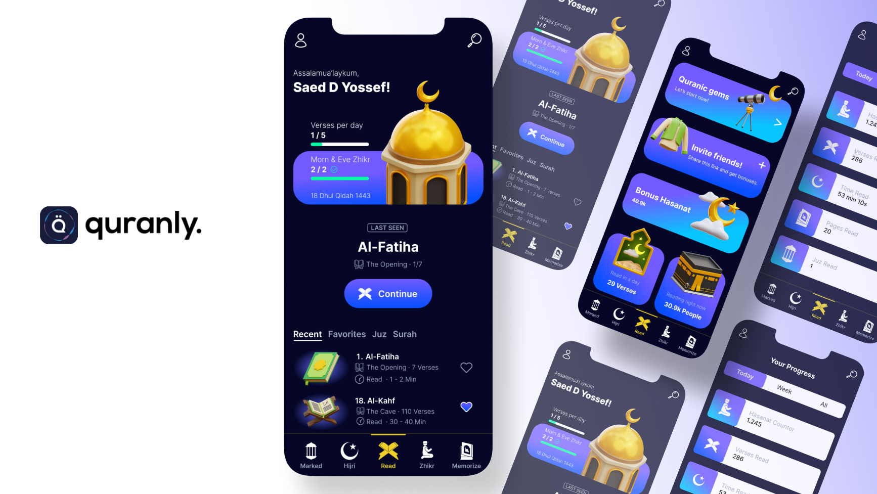
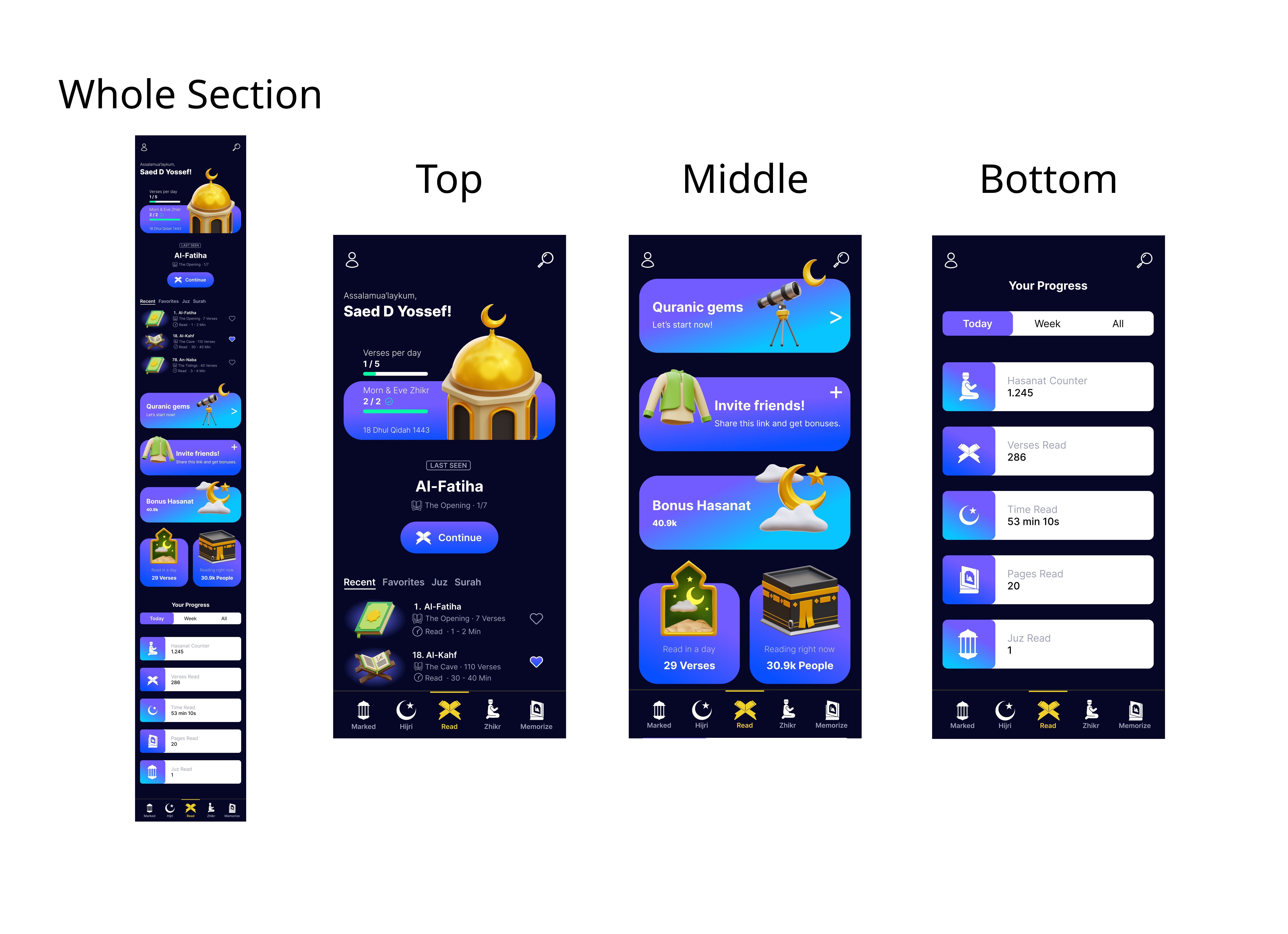
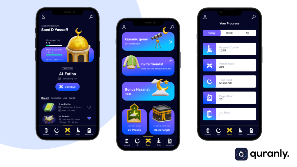
The client said that they just needed a new design for the main page (Home) of Quranly. Where the design must look modern and not boring, the client also wants the task completion feature and task completion notification with a green check mark.
The Goal
The client did not say the specific Goal of the project except for the presentation of a new design that seemed fresher and not boring. However, I did research and studied the main Goals of the Quranly app myself, by visiting their official website and understanding the features provided by the app.
To the point where I came to the conclusion that the main goal of the application is to make users much more productive and feel motivated to read the Koran with the various convenience features provided by Quranly.
So the application is designed so that users can feel comfortable and want to read the Quran in Quranly longer.
The Audience & Users
As I said above, the main audience of Quranly is users (Moslems) who want to improve their reading productivity with the holy quran using an instant mobile app.
Role & Responsbility
1. Project Manager
This is an app redesign project, I read the brief directly on 99 designs, and I set the timeline myself to accomplish the tasks.
2. Designer
I did research and also determined the design concept for this project itself, so that the previously created design will facilitate the workflow in the development phase.
Scope & Constraints
For this project I do it from scratch, I learned the problem and try to find a solution and realize it into an existing product design that will consumed by users. I also did the low fidelity (wireframing) and high fidelity design myself from scratch.
1. Homepage / Mainpage
Process
For the record, I didn’t do activities that I usually do, such as meeting with clients, and phone calls. etc. Because the project I took was a design contest project in 99 designs, so I didn’t do anything special except understand and read the brief well.
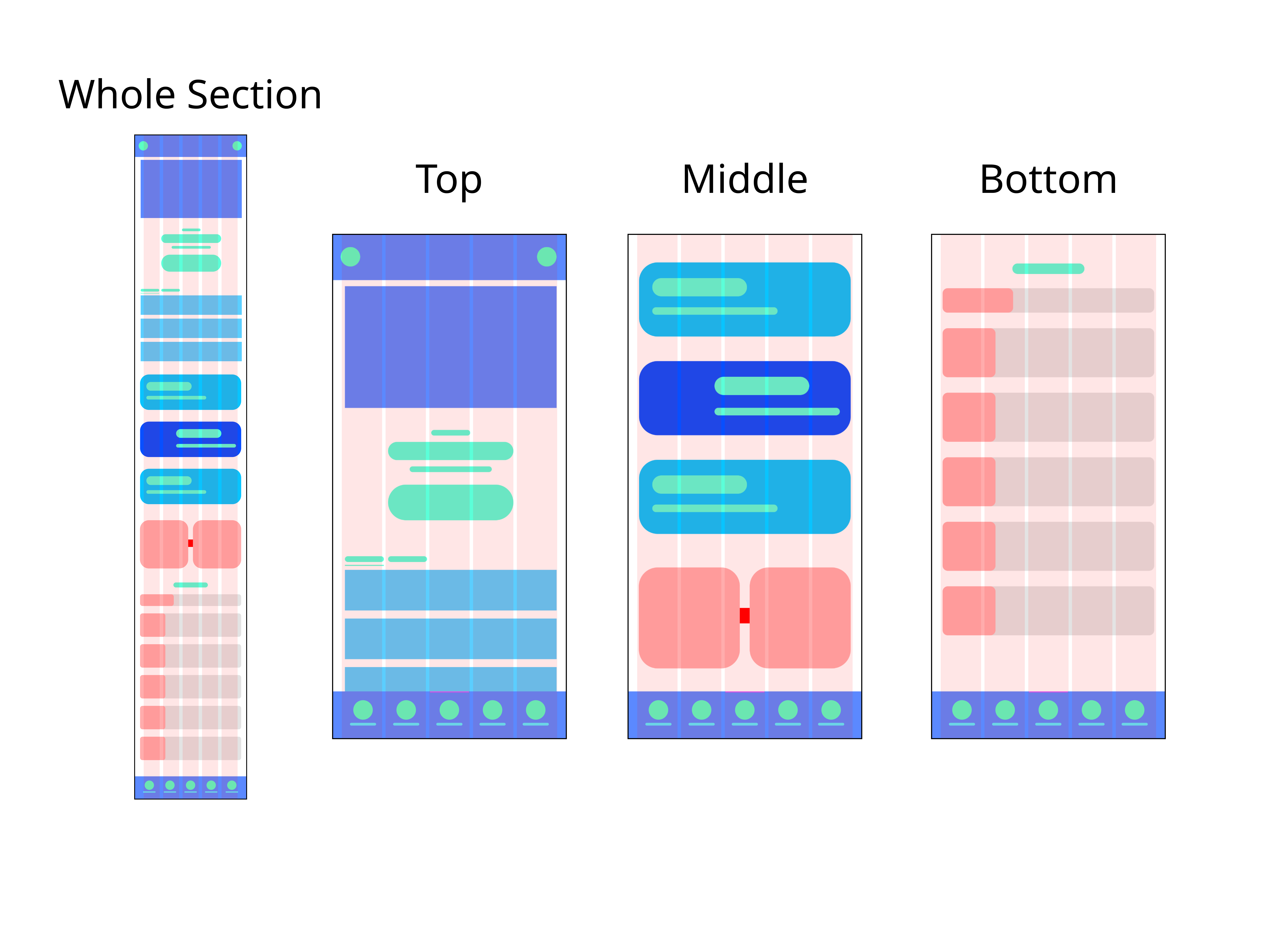
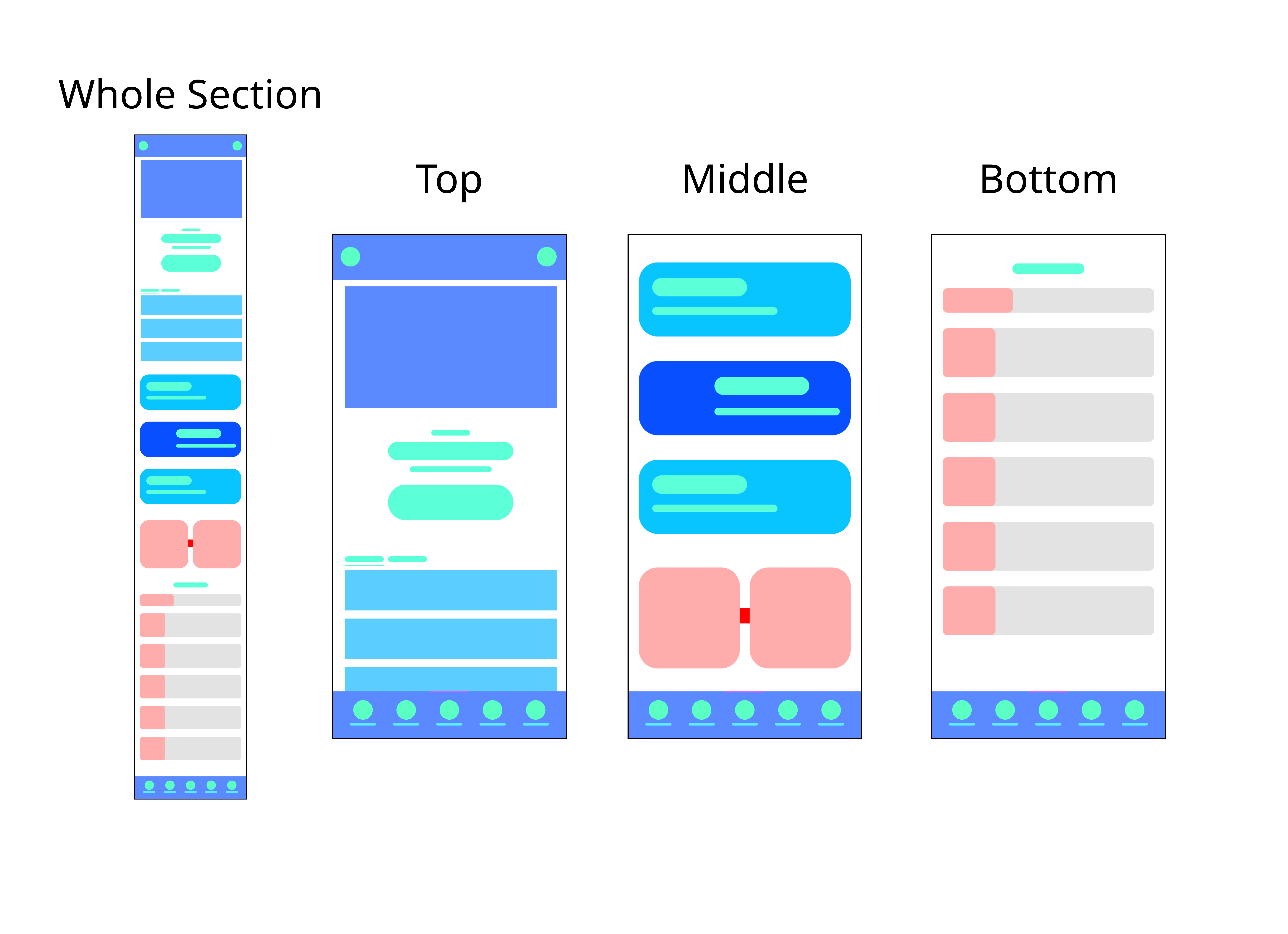
Wireframing / Lo-Fi Grid
Quranly Wireframing Grid
Because I designed it from scratch, my first step is to make a wireframe. I’m always using a grid even for only wireframing cause I want to get my workflow more efficient and it really helps to visualize what kind of feature that I need to put or what structure that reliable to the product that will show on the App.
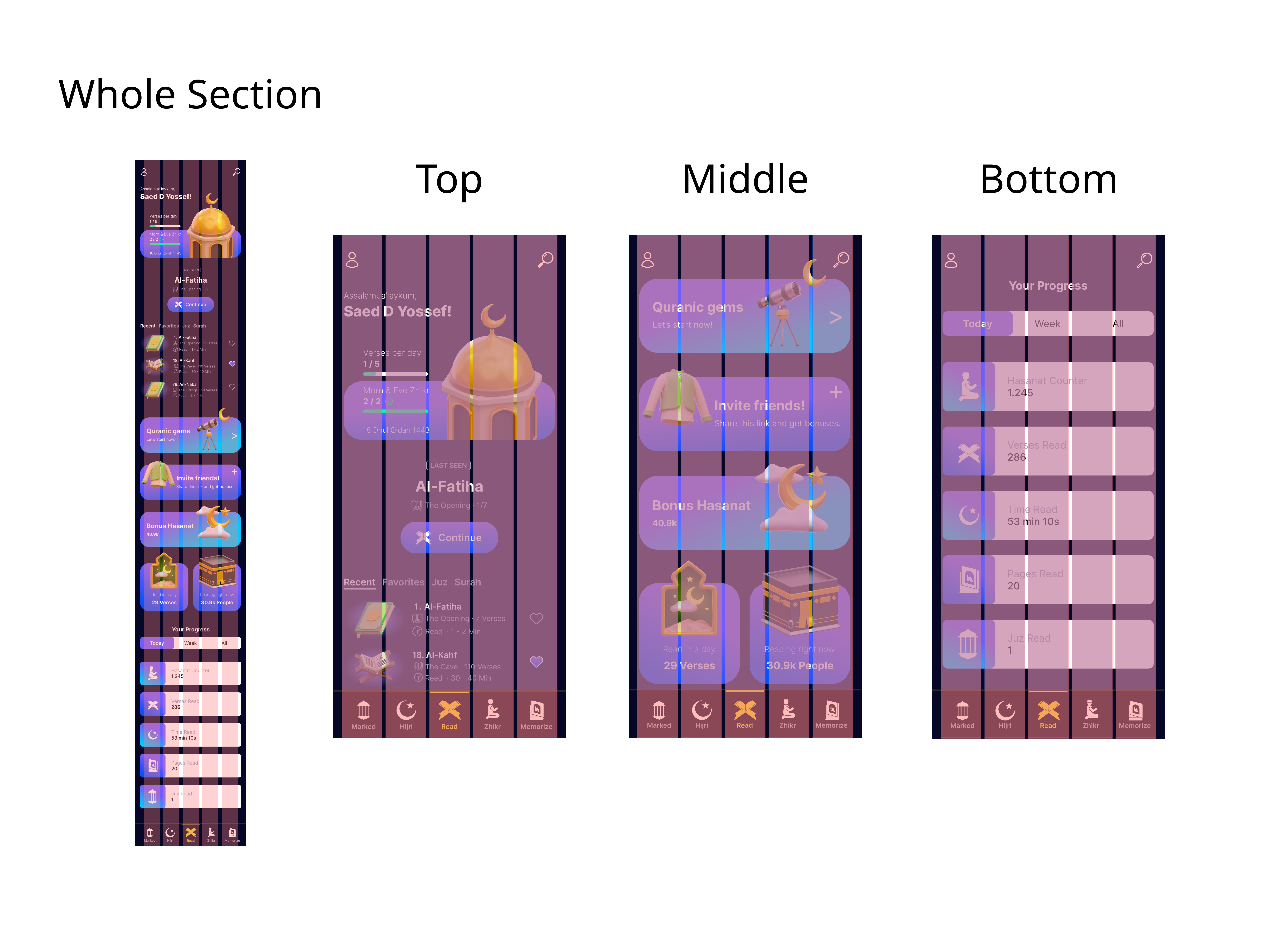
High Fidelity Grid (Hi-Fi) Design
Quranly Hi-Fi Grid Phase Design
As always not only in wireframing phase, I used grid too in the Hi-Fi phase. Just like I mentioned before the grid really helps me to keep the content fit to the layout, so the content and all the child section will be more structurize and tidy.
Colors Palette
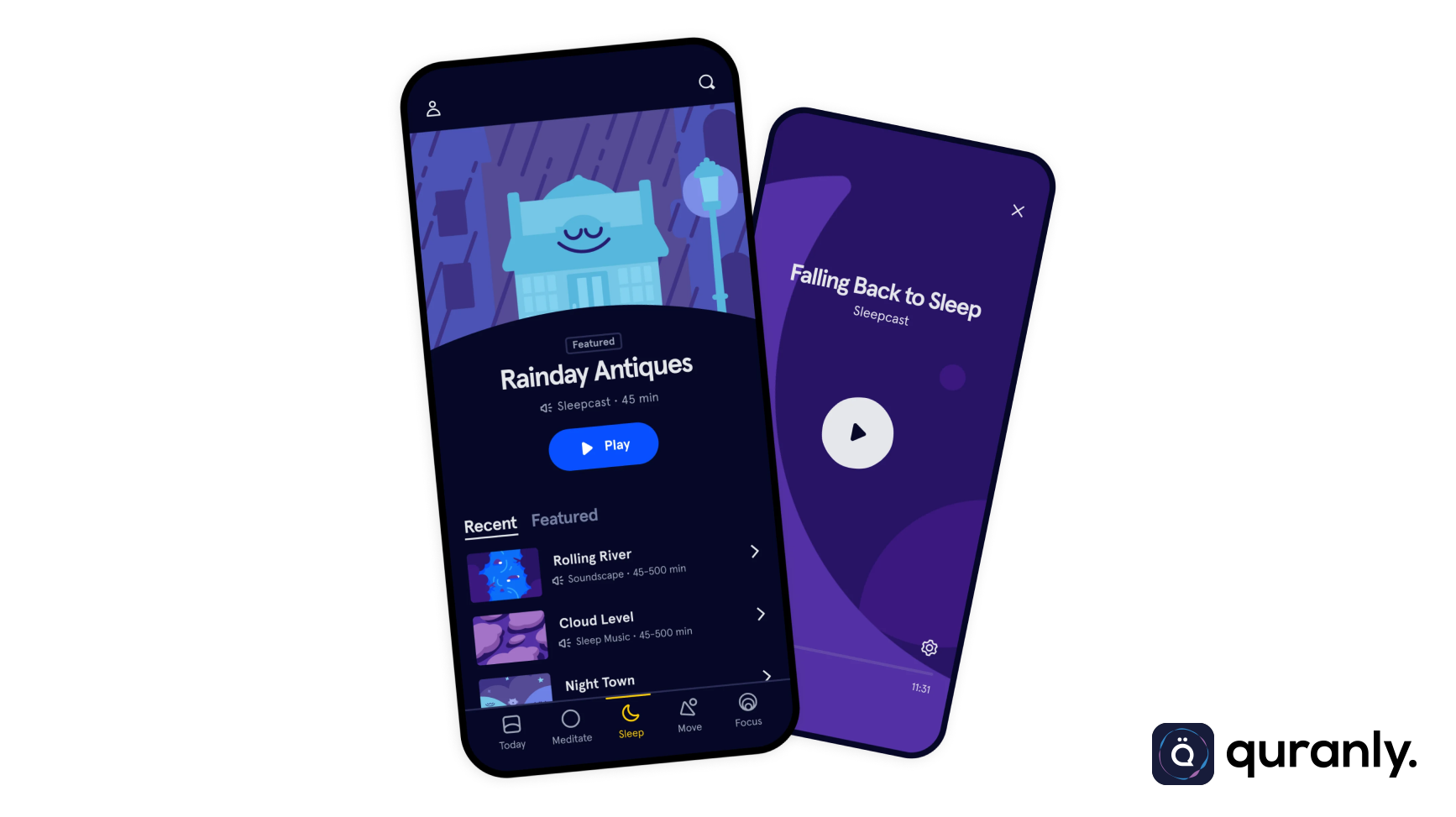
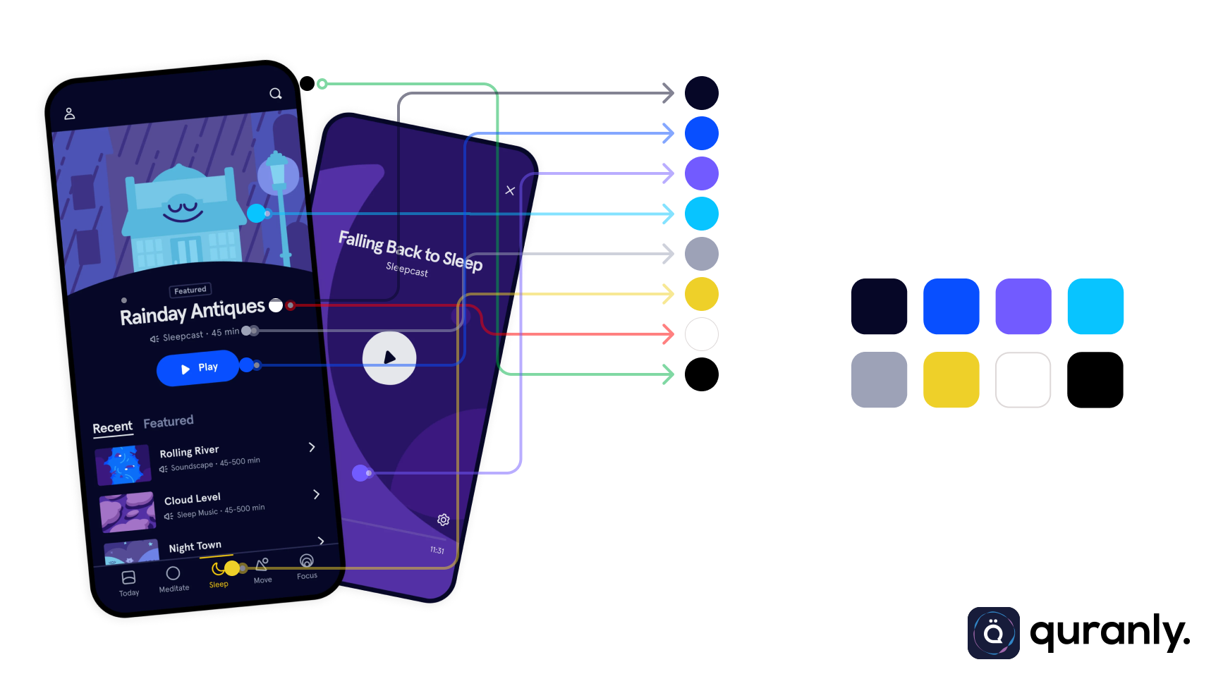
The colors that I picked are according to the brief, and the client expects The Headspace color style can be implemented on a new design for Quranly so again I followed the brief. I didn’t copy the exact color of Headspace I only picked 3 colors of theirs, and I picked it myself for the rest.
Quranly App Colors Palette Dent Difa
Icons
I use paid icons in this project, and I’m updating the colors and styles to match the new app identity. The reason for using this paid icon is to avoid the similarity of web assets with existing projects on other websites, especially competitor websites operating in the same industry. So hopefully Quranly has an app that looks more exclusive.
Quranly New Icons Dent Difa
Design & Decisions
The Clients leave it entirely to me what kind of design will be displayed both in the main section, and other sections that will become supporting elements in the Quranly app later. There are no special requests or notes from clients regarding the design other than what was briefed in this contest. I put some improvements and feature that will make Users’s life easier, and I will explain it below at “Selected Section”
Selected Section
There are several selected sections that are crucial in nature and I will present them in this case study.
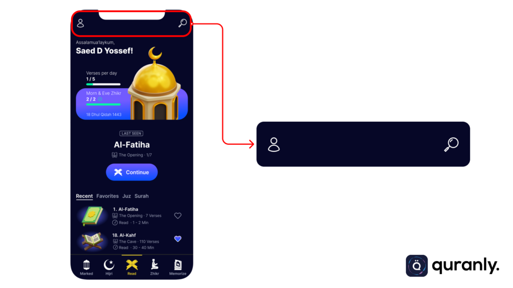
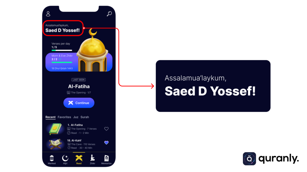
Top Navbar
There is a profile icon to help users see things related to the user profile such as user bio, settings, payment, etc. The search icon aims to make it easier for users to find the surah they want to read.
Quranly Top Navbar Dent Difa
Bottom Navbar
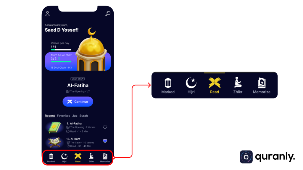
In this toolbar, there are several button icons that make it easier for users to navigate the application. I made improvements from the old application toggle model, in this design I put 5 buttons.
Quranly Bottom Navbar Dent Difa
- Read
As a button for the main page / Home - Marked
A marker of some verses that are felt to touch or are very important to the reader. This feature is very useful when the reader is reading the translation of some of the verses described in the Mushaf. So that later they can look back at the verse as a reminder of themselves through the list that has been classified on this “Marked” icon. - Hijri
Hijri date button feature that will make it easier for users/readers to make special plans to read the Koran at key times such as the month of Ramadan, or other special dates that have their virtues in the Shari’a. - Zhikr
Contains reading guidance for prayer or dhikr according to the recommendations of the Qur’an and Hadith. Like morning and evening dhikr, and others. - Memorize
List of surahs that Quranly readers want to memorize. Because the user needs to read the manuscripts, sometimes it is not just reading but also wants to memorize certain surahs and verses to read their prayers and pursue other shari’a virtues.
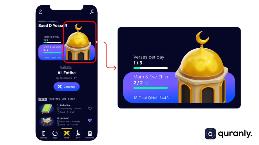
Mosque Visual
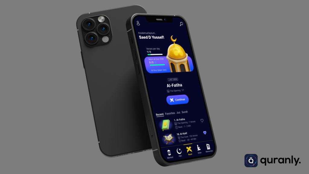
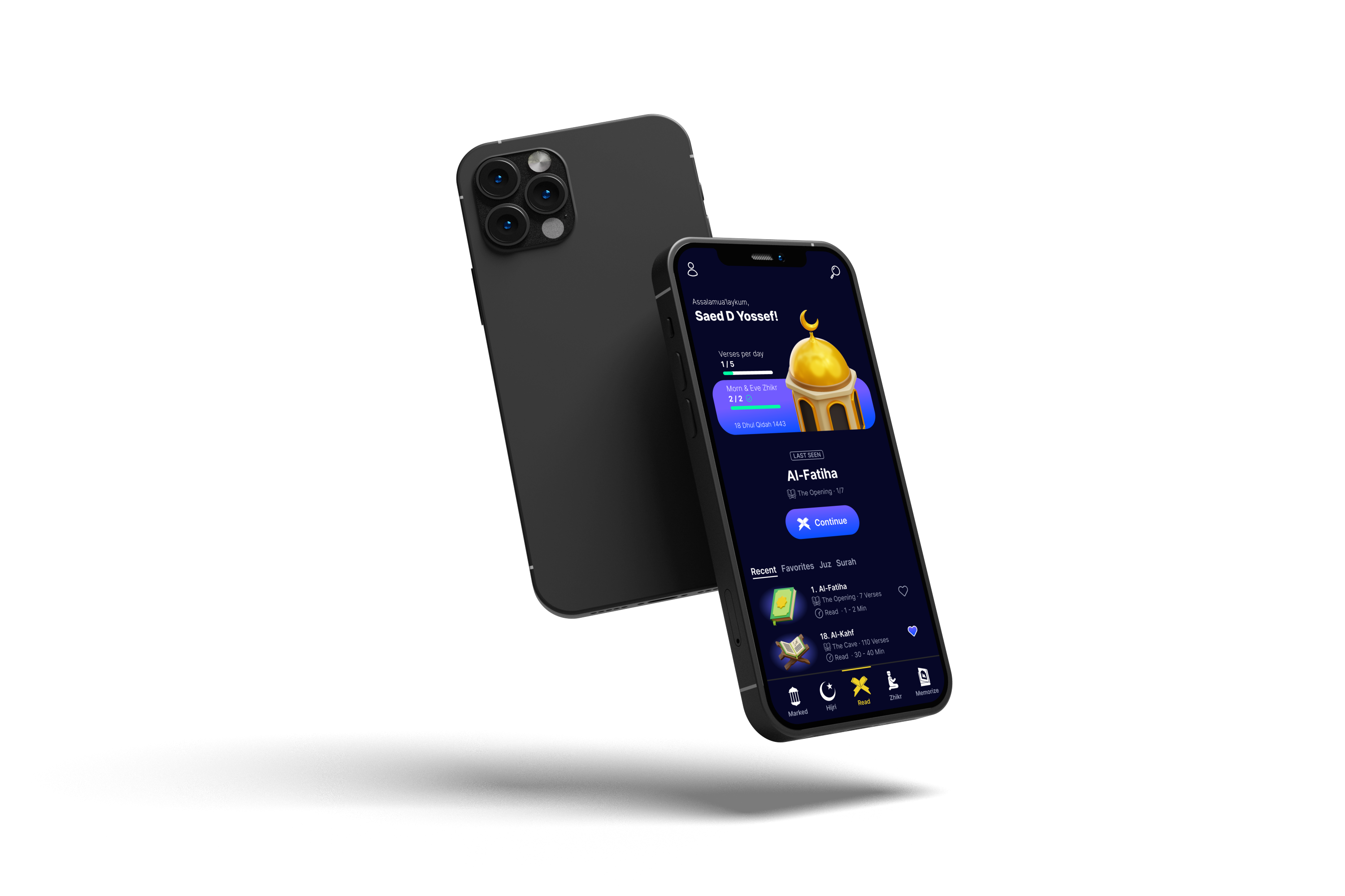
I added a visual of the mosque with the overlapping method, because in the design hierarchy it is very important not only as a sweetener, but after seeing the image the user will immediately focus on the daily task on the left. So this can make users want to stay longer in the Quranly app.
Quranly Mosque Visual
Shortcut Section (Recent, Favorites, Juz, Surah)
I got a lot of positive feedback from competing users that this feature really helps them when they want to be more productive with the Quran application. I will give a little explanation and the reasons behind the placement of these features based on research.
Quranly Shortcut Section
Recent
To find out the history of the user’s last reading. In this section, I complete several elements such as:
- Visual Mushaf
- Name and Surah Number.
- Information such as the translation of the title of the sura, the number of verses, and the estimated reading time. I got quite a lot of attention from users for this reading time estimation feature, they said it could make it easier for them to choose which type of surah suits the target reading time they want, along with the love icon feature that will mark the surah to enter the favorites list.
Favorites
This feature is the feature that gets the most positive responses from users because there are certain surahs in the Quran that they like and become favorites for them. In addition, the layout of the “Favorites” feature is very helpful for users as readers because just by doing a slide or clicking, they can immediately see their favorite surah or reading on the main page of this application.
Juz
Many skilled readers have a target of reading more than the general reader. This must also be considered because they are also people who are categorized as our Users (Quranly). I included this feature to make it easier for them if they want to immediately read at least 1 juz or more. Even this kind of behavior is often encountered during Ramadan because they pursue the target of “Khatm al-Qur’an” as much as possible in this noble month.
Surah
A common feature that allows the user to read certain surahs.
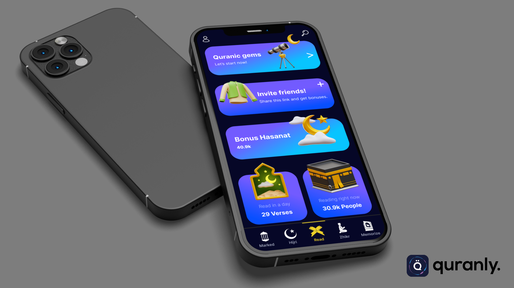
Invite friends
I put a picture of a shirt to describe potential new users and avoid using illustrations of perfect human faces considering that this design will be for application-based holy books, besides that there are special prohibitions in Islam regarding this, so I will not do things that are considered contradictory to sharia provisions.
Quranly Invite Friends
Hasanat Bonus
Goodness that continues to flow is certainly the desire of every good Muslim, I chose the visual of sunny weather with good conditions to give the impression to users that “the more good that other people do because of you, the more good you will be rewarded in the future.”.
Quranly Hasanat Bonus
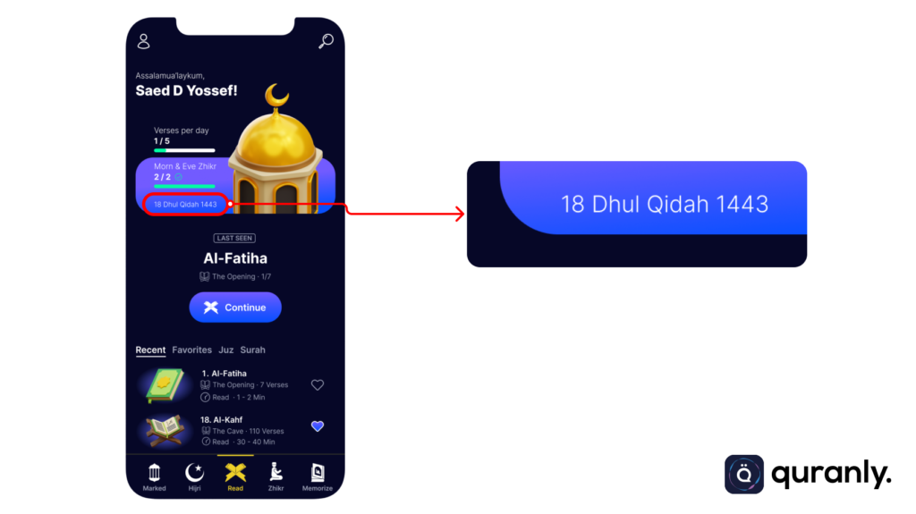
User Progress Section
In this section, I did not make any significant changes. I only add icons that are relevant to the information presented and use a purple background that has been well improved with gradations that are aligned and consistent with the purple theme style in this application later.
Quranly User Progress Section
NOTE
I added special stats information, namely the number of “Juz Read”, I really consider a lot of users or readers who read with a target of at least 1 juz or even more, especially during Ramadan. Many of the Quran readers I have encountered are like this, so I use this as an additional feature that will make the user’s life easier, and they do not find this in other mushaf applications except Quranly.

