July 22, 2022
Antier Armchair Web Design
This is a case study of web design process for armchair company name Antier.
Client
Antier
Project
Web Design
Website
ANTIER
ANTIER
ARMCHAIR
ARMCHAIR
Intro
This project is a web design project for the Antier brand. Antier is a company engaged in furniture, especially armchairs, Antier only has 3 variants of chair products, all of which are made to increase productivity, effectiveness, and comfort for users, especially professionals who spend most of their time working while sitting.
The Problems
The client wants to display a company profile that looks simple, and elegant, and also gives the product a productive impression. The client wants Antier to be able to accept purchases online but unlike the web marketplace model with a complex product catalog, customers can make online purchases via email because so far sales are still being made offline by the company.
The Goal
The purpose of the Antier website design was to focus on only 3 things.
Web Company Profile, To display the existence of an online company that focuses on brand awareness.
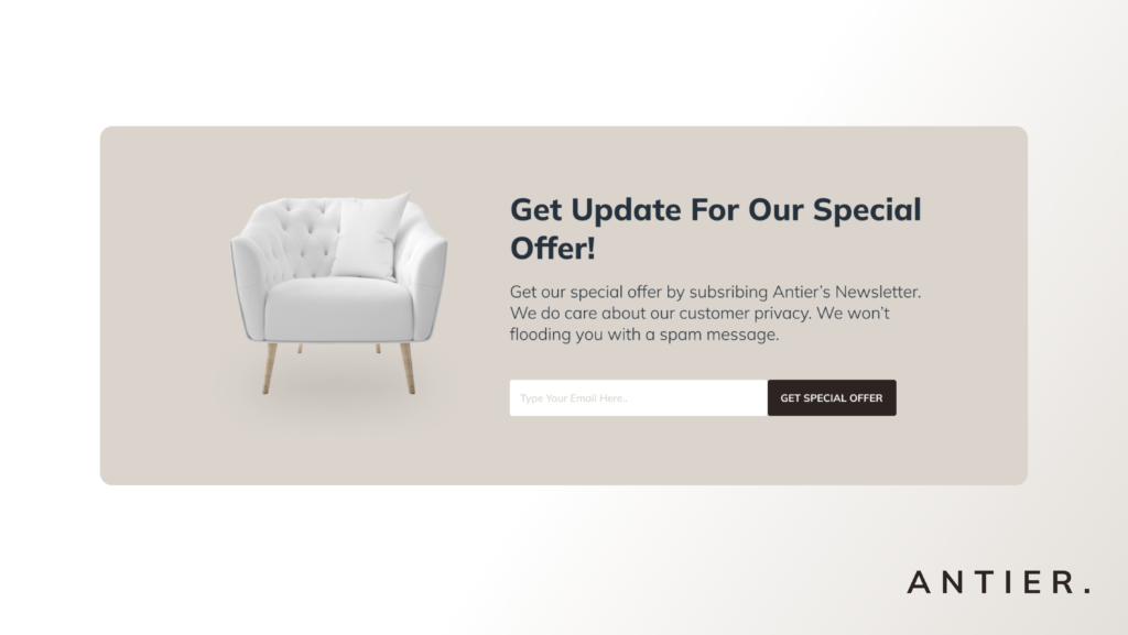
Leads Collection, Leads collection by getting contact information in this case the potential buyer’s email.
Message delivery, the Antier armchair product is the best armchair product that focuses on the value of productivity and user comfort.
The Audience & Users
The main users of Antier are professionals aged 23 – 40 years who are used to sitting for long periods and are passionate about productivity and efficiency.
Role & Responsbility
1. Project Manager
This is an app redesign project, I read the brief directly and I set the timeline myself to accomplish the tasks.
2. Designer
I did research and also determined the design concept for this project itself, so that the previously created design will facilitate the workflow in the development phase.
Scope & Constraints
For this project I do it from scratch, I learned the problem and try to find a solution and realize it into an existing product design that will consumed by users.
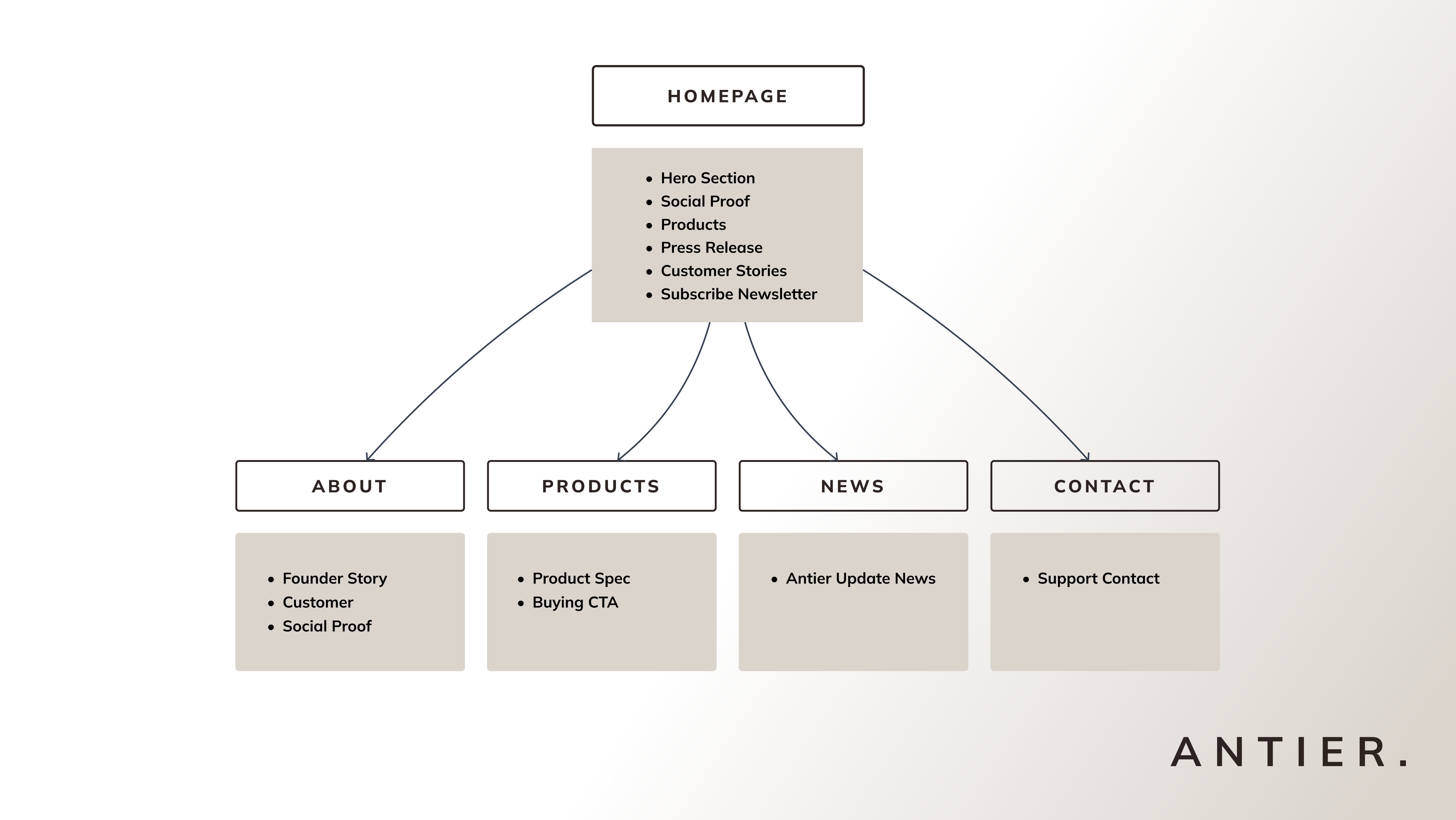
1. Homepage
2. About Page
3. Products Page
4. Contact Page
5. News / Blog Page
Process
I did several stages in this Antier web design process, Brief Understanding > Sitemapping > Moodboarding > Wireframing (Low Fidelity Design) > Mockup (High Fidelity Design)
Moodboard & Feature Reference
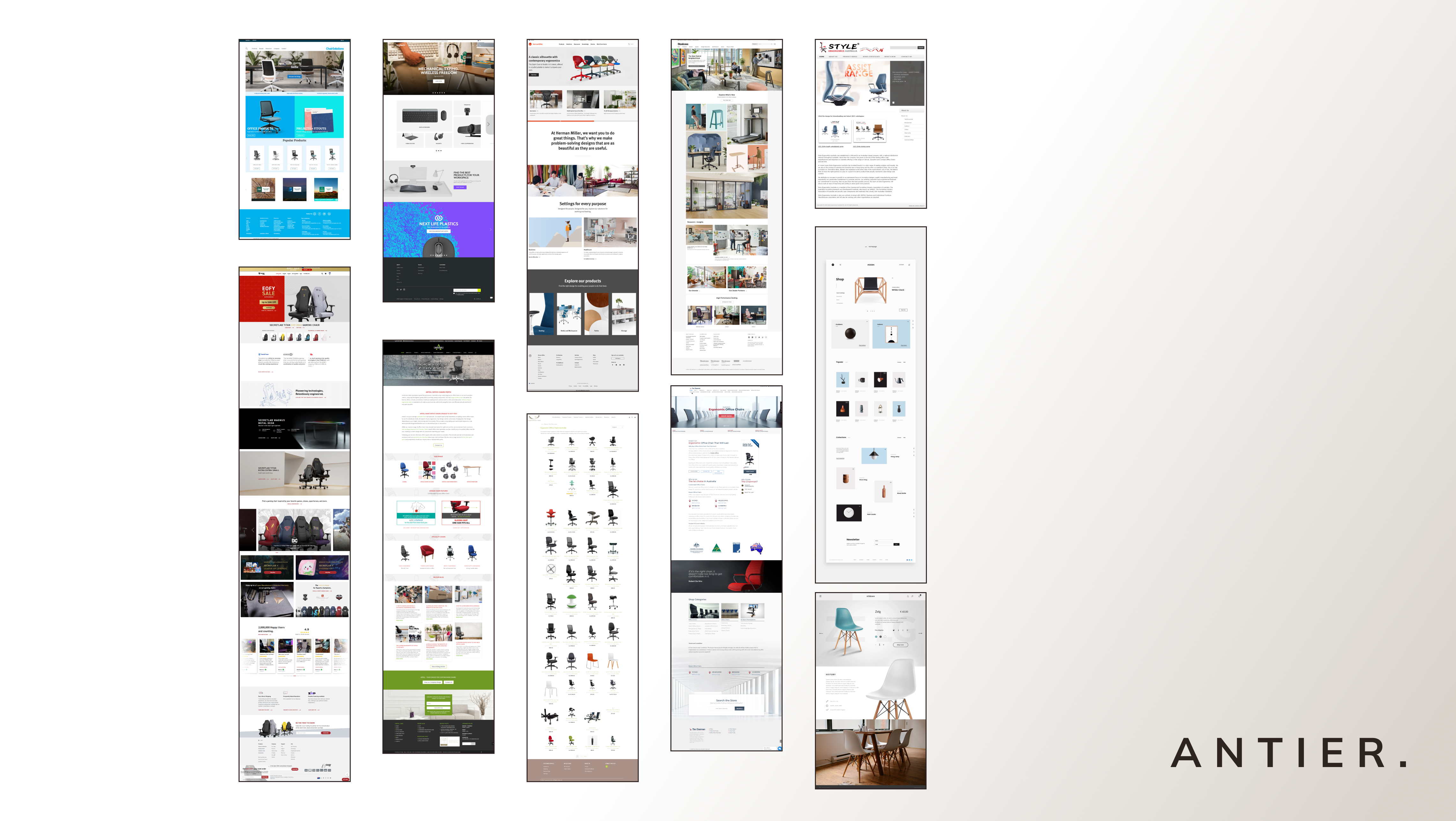
The references I chose below are references from web competitors and several websites that have a relevant structure and style that you want to use on the Antier website, one of which is the Logitech website. As for the web competitors that I chose were Herman Miller, Secret Lab, and several local brands.
Antier Moodboard, Dent Difa
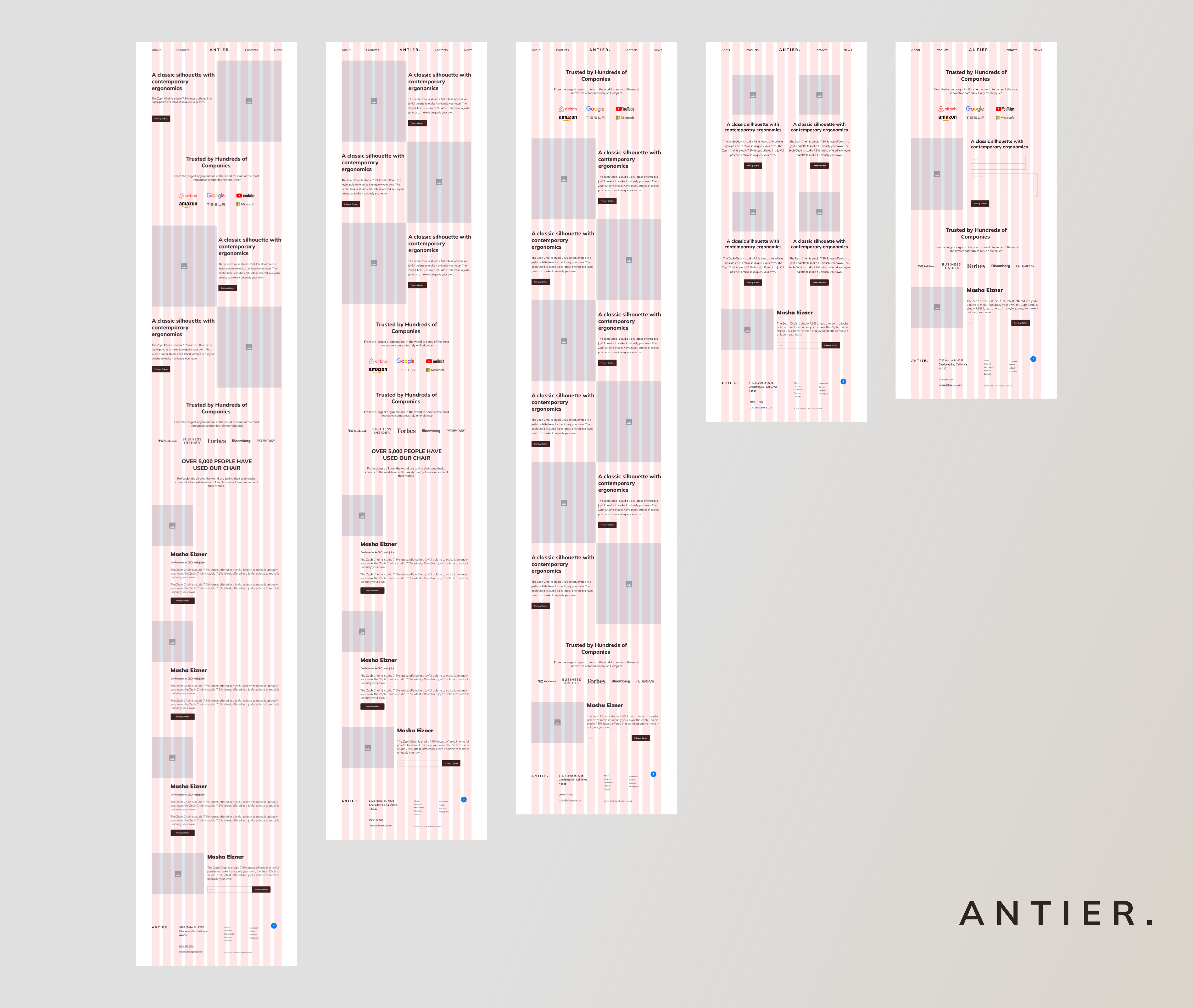
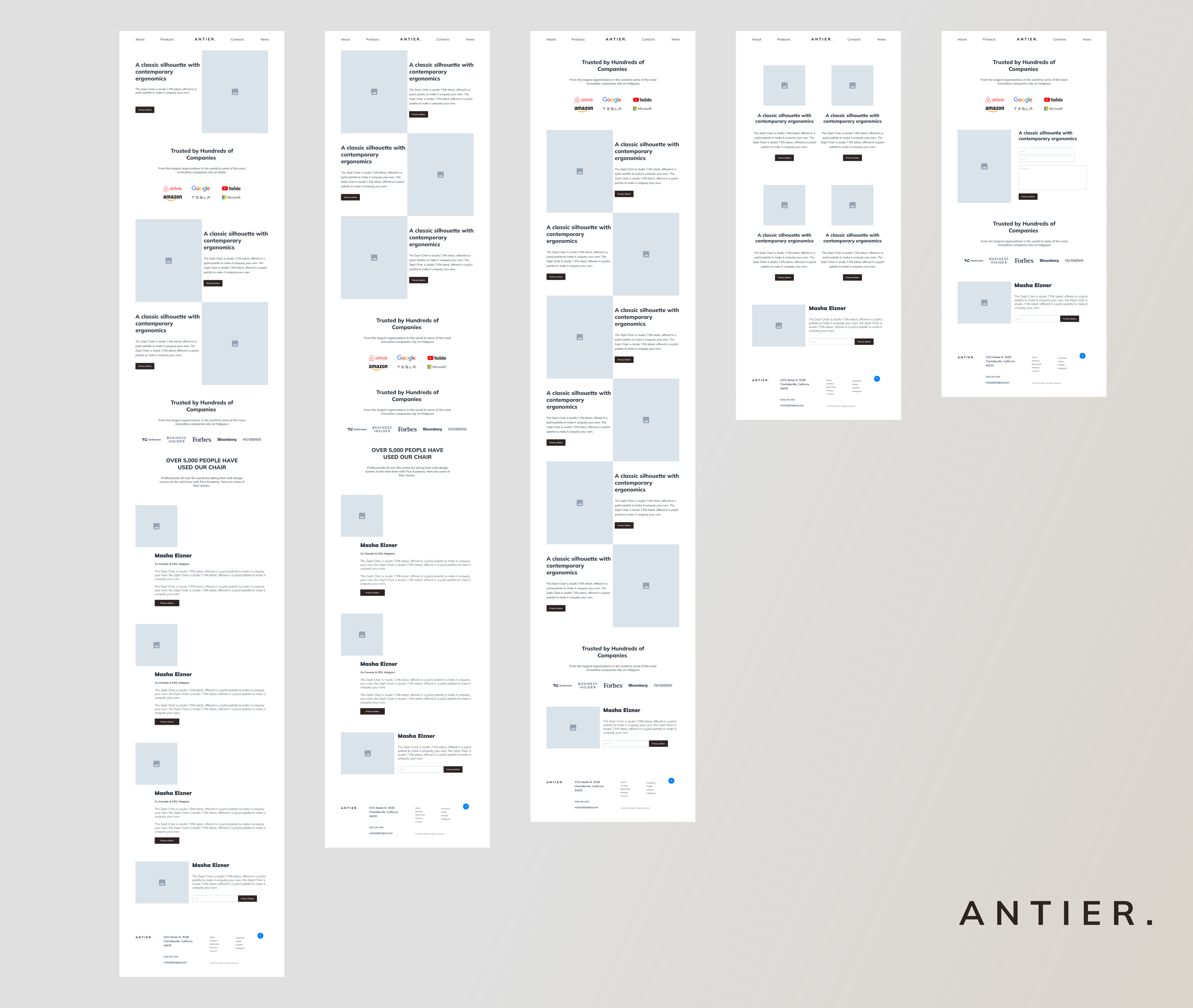
Wireframing / Lo-Fi Grid
Antier Grid Wireframe, Dent Difa
After the sitemapping and moodboarding stages I started by structuring in this wireframe phase, what I focus on here is adjusting the layout of each Antier website component in the form of a raw framework. I’m used to wireframing with a column grid because it not only makes it easier for me to work but it makes the placement of elements on the web more precise.
Wireframing / Lo-Fi Final
Antier Wireframe, Dent Difa
When I finished compiling the web framework as a raw image, I disabled the show feature on the grid so that the column grid was temporarily lost to make sure the layout of the previously created template was proper and ready to move on to the next phase of high-fidelity design or preparing mockups.
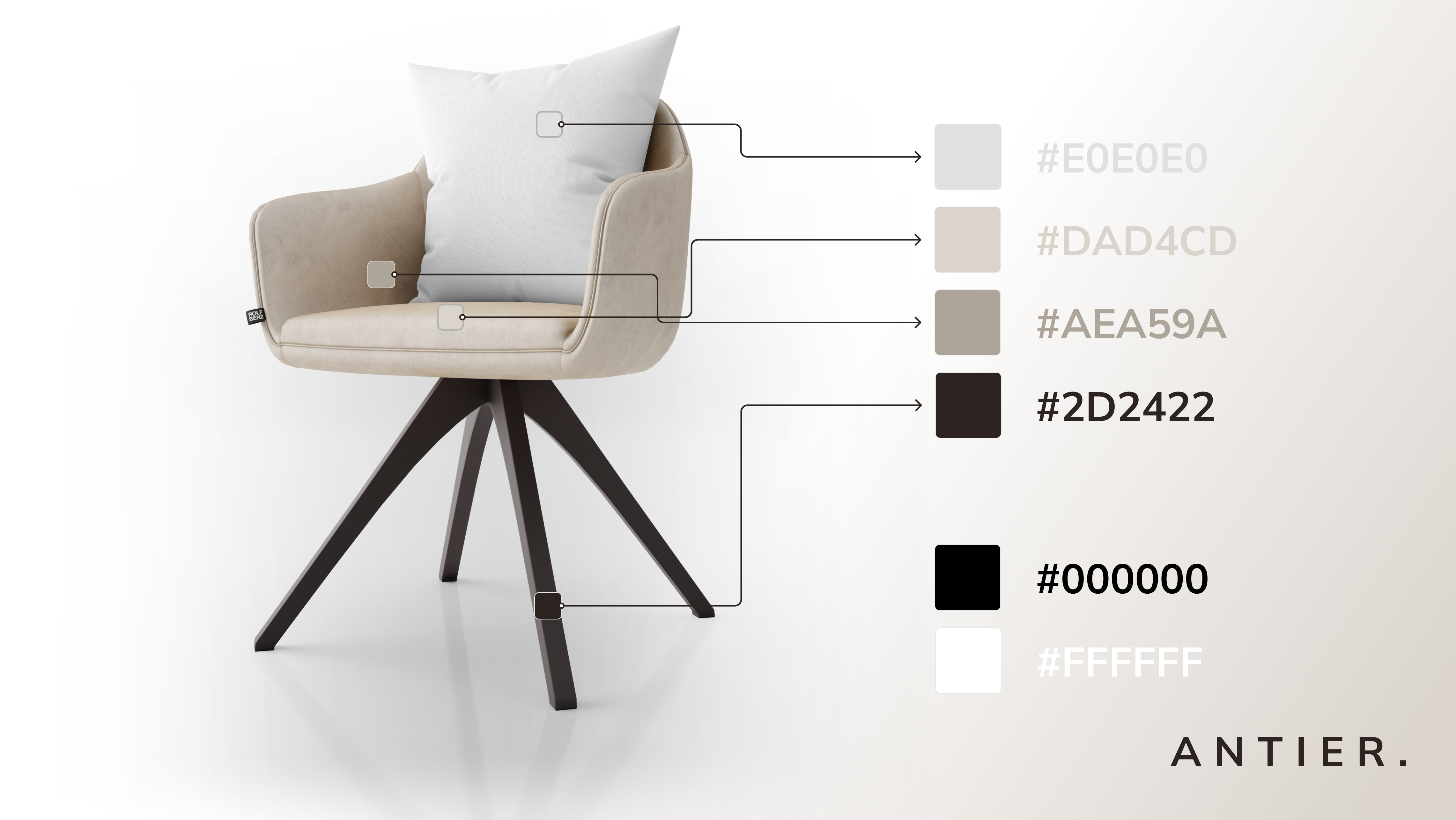
Colors Palette
I took 6 different color combinations, 4 of which are colors whose inspiration I got directly from the Antier product itself, namely brown which dominates the color of the product, and gray.
Antier Color Palette, Dent Difa
My goal is to take direct color inspiration from Antier products to emphasize and give the impression to users through the website that Antier is a furniture brand that focuses on armchair products.
Antier Color Reference, Dent Difa
So that the color selection seems more natural, and this is also supported by the absence of style guidelines from the Antier brand itself. So I did my own theme coloring and made sure that every element that was displayed remained consistent as a whole
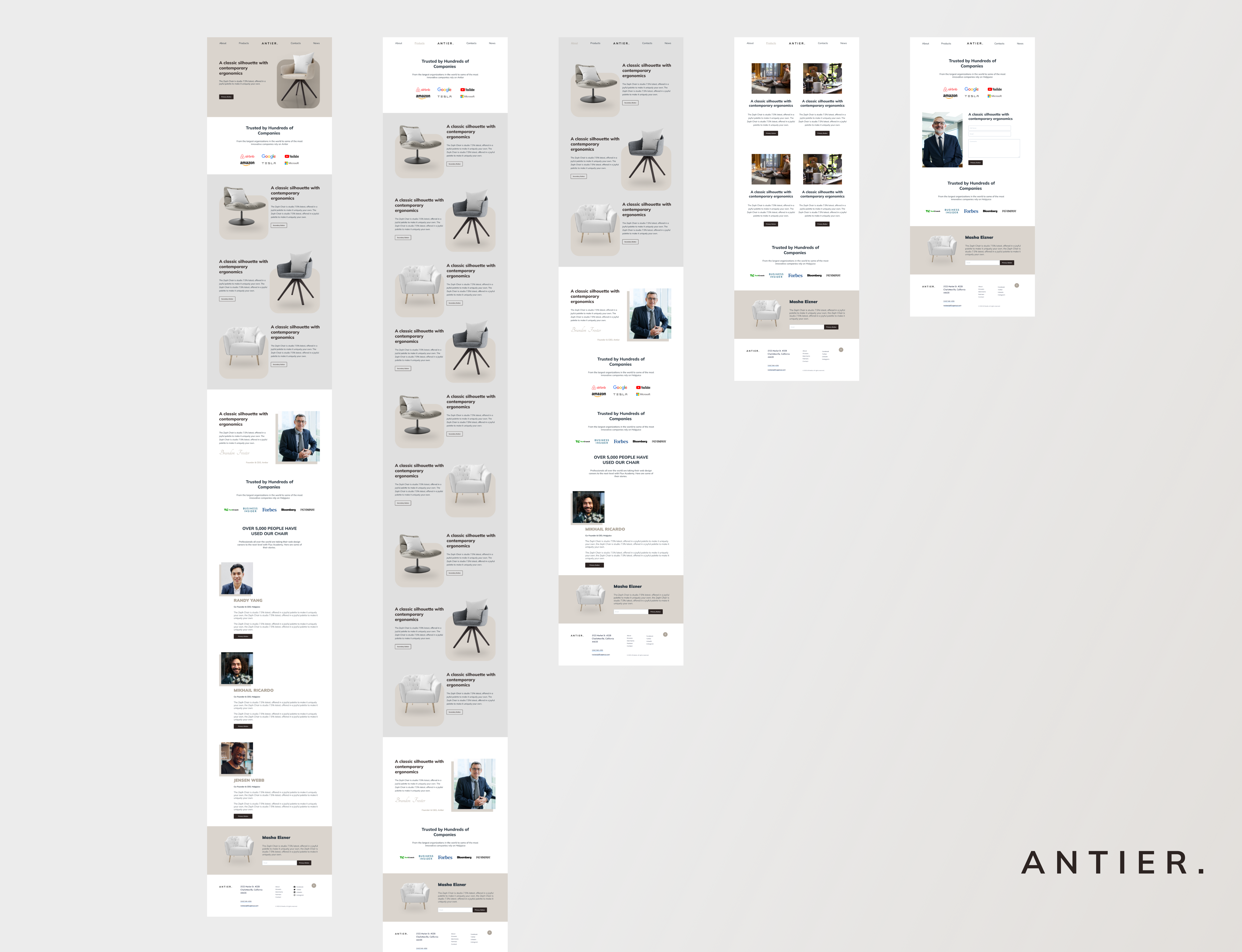
Mockup (High Fidelity Design)
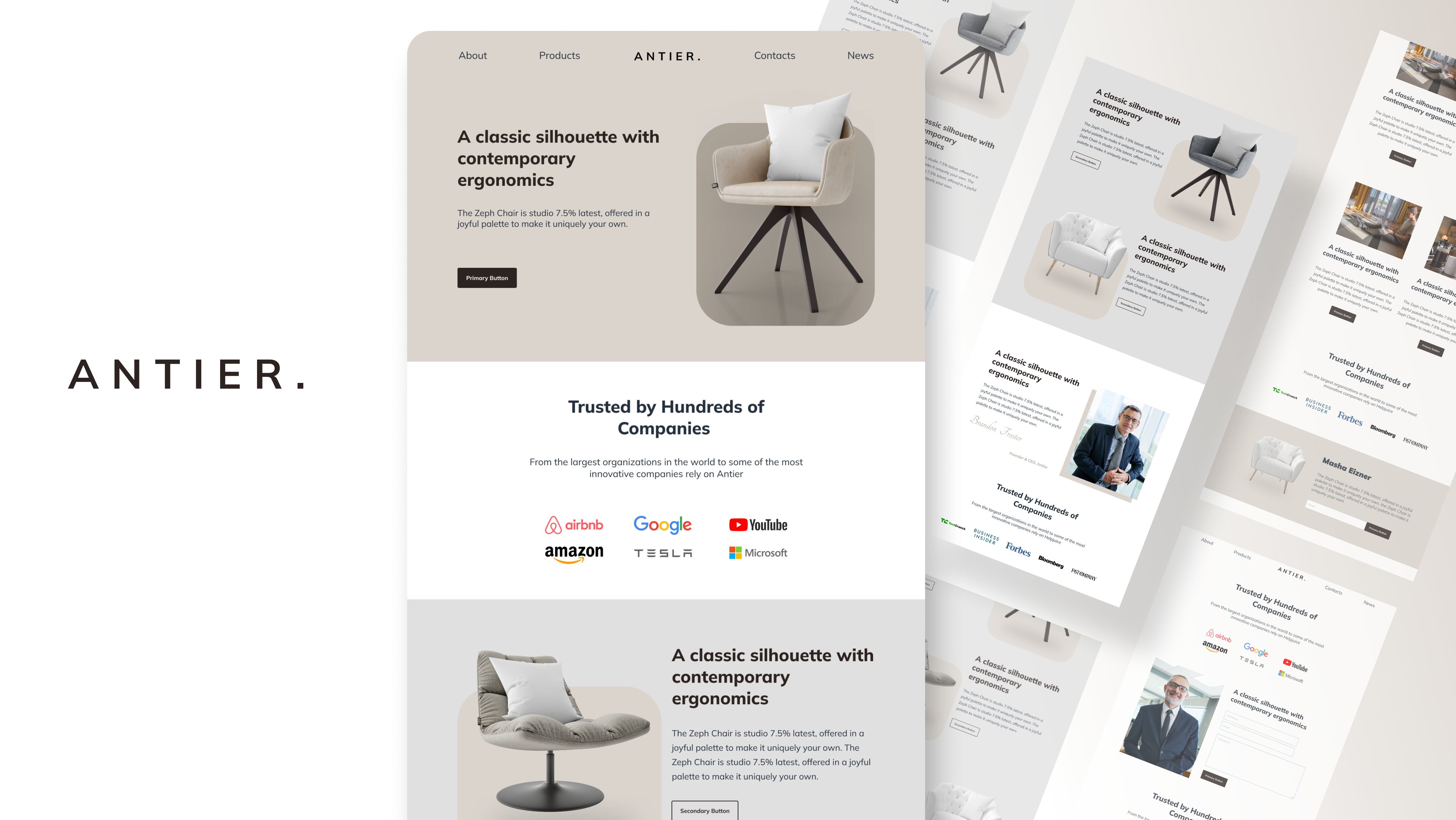
Antier Mockup High Fidelity, Dent Difa
All the icons that I use are free icons with commercial licenses so that in the future there will be no problems regarding copyright law for their use. I chose a containing icon instead of choosing a line shape icon to keep it clean and consistent with the overall style of the website.
Icons
All the icons that I use are free icons with commercial licenses so that in the future there will be no problems regarding copyright law for their use. I chose a containing icon instead of choosing a line shape icon to keep it clean and consistent with the overall style of the website.
Antier Icon Selection, Dent Difa
Design & Decisions
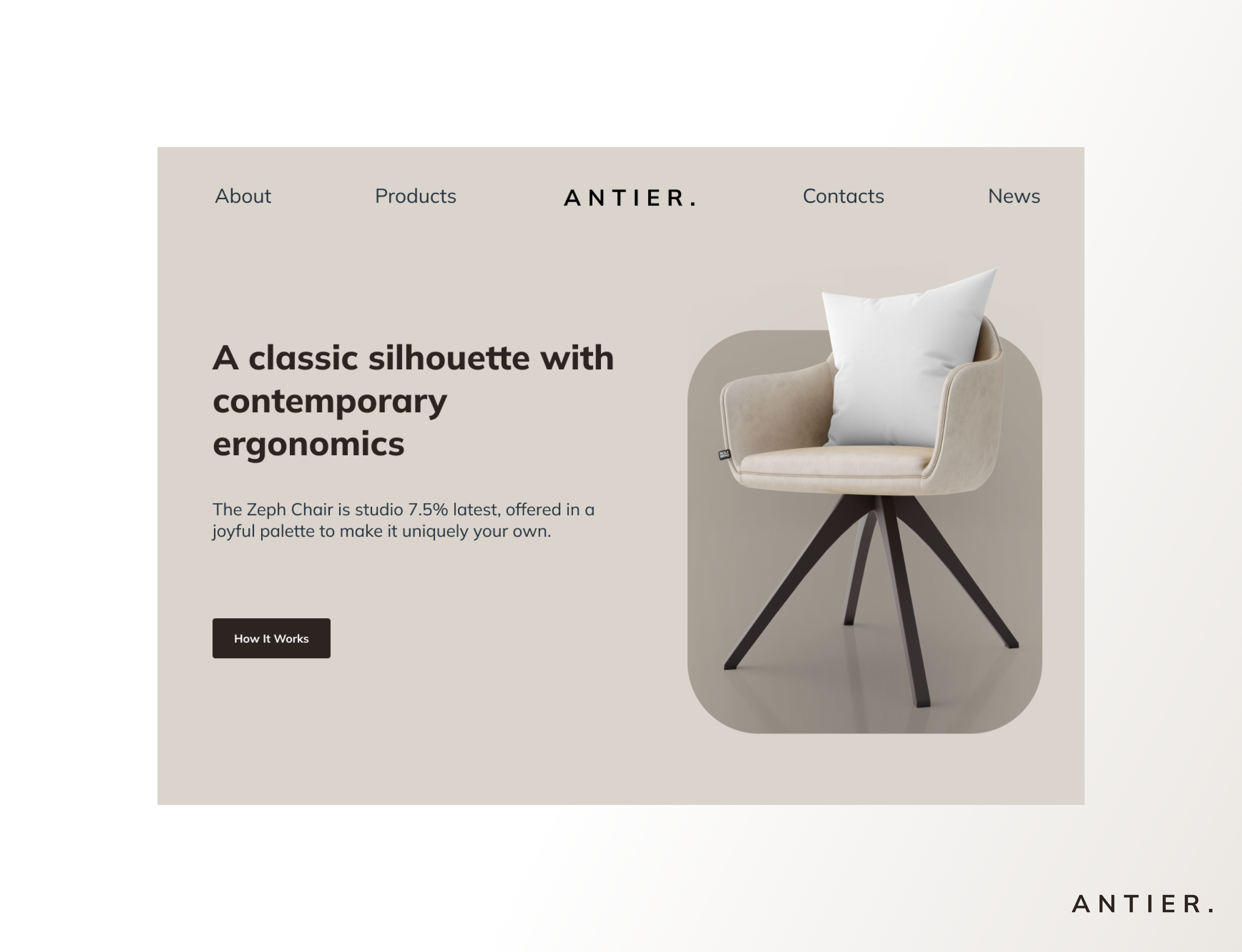
Hero Section
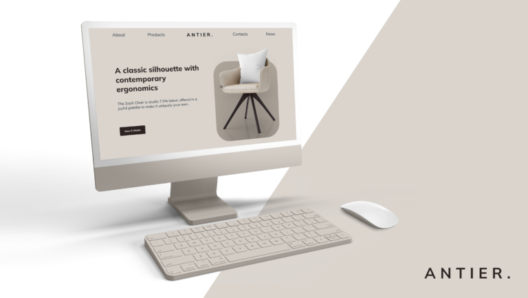
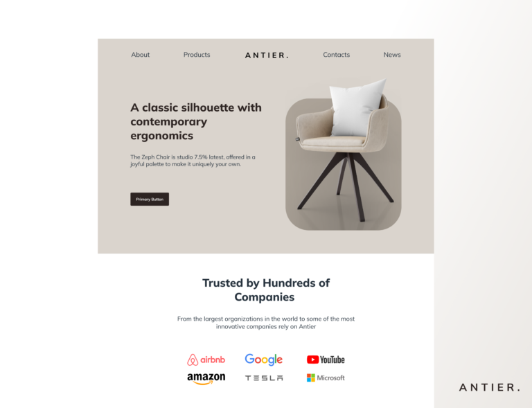
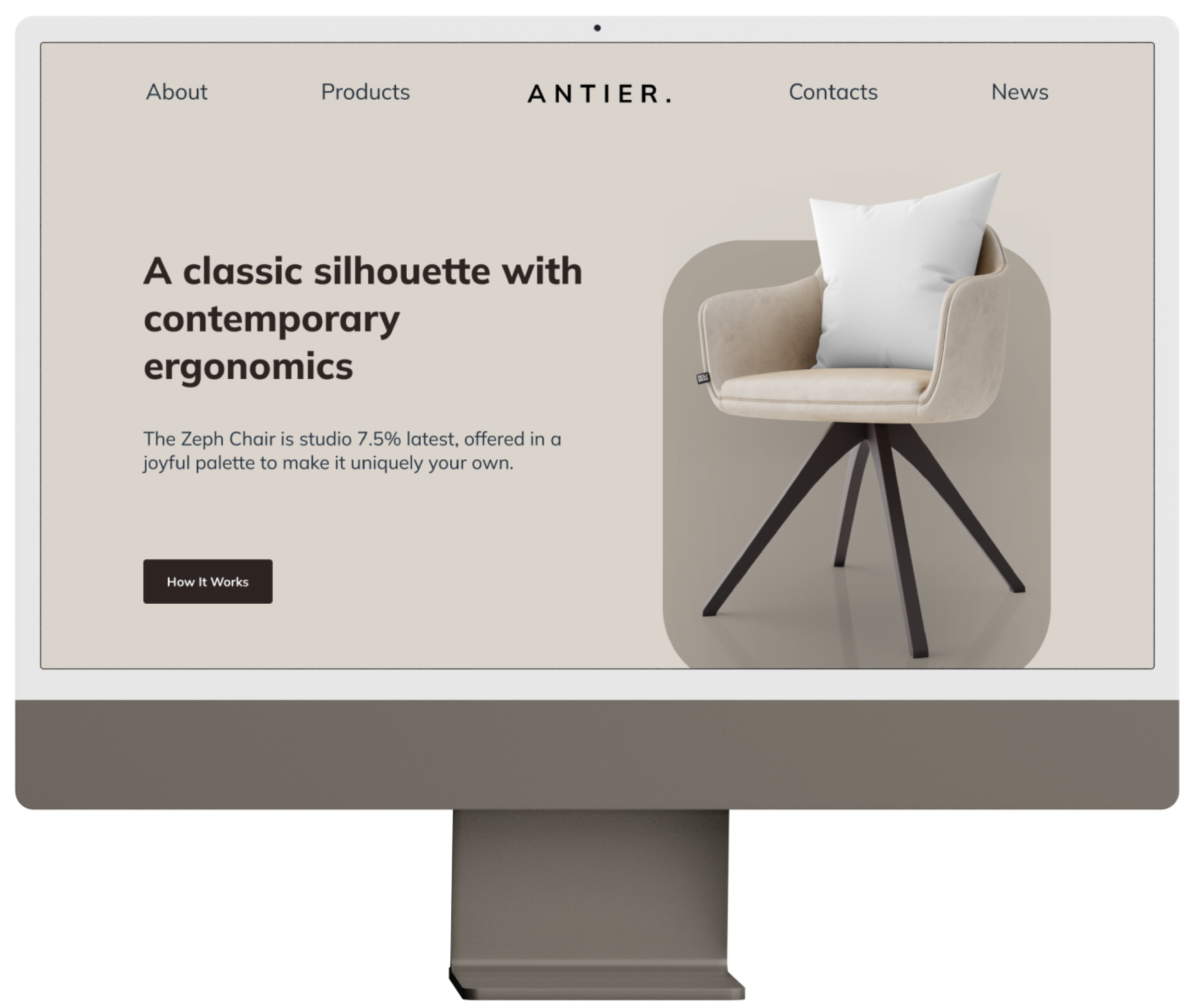
In this phase, I want to draw the user’s attention to the visuals of the Antier chair product above. I made the order of the user’s attention on this hierarchy through the stages of visual > headline > subtitle > CTA, the order was not made without basis but I made it based on the priority order of which elements should be the focal point and get more attention from the user.
Antier Hero Section, Dent Difa
I made the picture of the Antier chair the main concern so that users have a strong first impression of the Antier brand, with the combination of a color palette that has been adjusted and aligned, this brand looks like it has consistent style guidelines on its company profile.
Referring to the initial brief, everything I do is still directed towards the goal of creating this web, how can the Antier brand profile look clean, elegant, and simple at the same time because value productivity and efficiency are the two main values of this brand.
Big Brands Social Proof
Antier Big Brands Social Proof, Dent Difa
I pinned these big brands after the hero section because if the user is interested in the visuals presented by the hero section, I want to “give a message” to the user from the business side that the products made by Antier are the best products that are trusted by big companies, so that can be more convincing users who are still unfamiliar with Antier products.
Featured Press Release
Just like the Big Brands Social Proof section, I want to re-strengthen the user’s sense of trust in the Antier brand before presenting the main products of this brand to them.
Antier Featured Press Release, Dent Difa
By displaying positive news coverage about Antier that has been published by major media to users, when the user clicks on each of the logos of the news company, the user will be directed to links to related articles published by the major press media.
CTA (Call To Action)
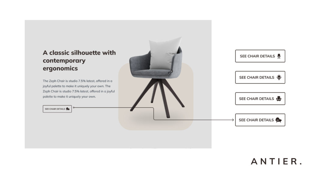
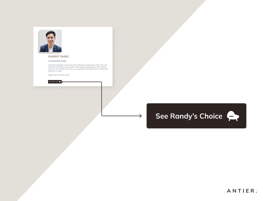
Clarity is something that crucial in web design. I made clear action directions with the words “See Chair Details” rather than weak directions like “See Now”, “Learn More” etc. because I want to give clear directions to the user.
Antier CTA Decision, Dent Difa
What actions should they take when they see this section, where will they be directed, and what will they expect in the future. So that it will provide a good experience to the user in navigating the Antier web later.
Customer's Stories
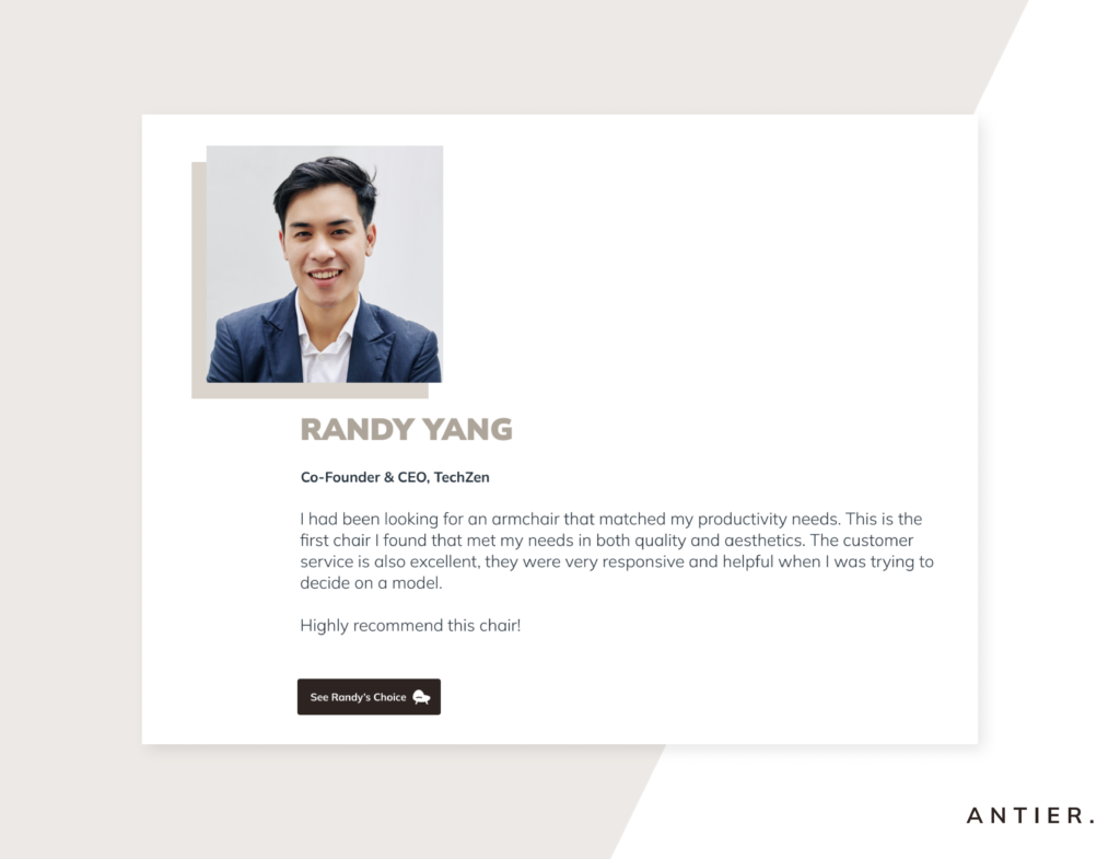
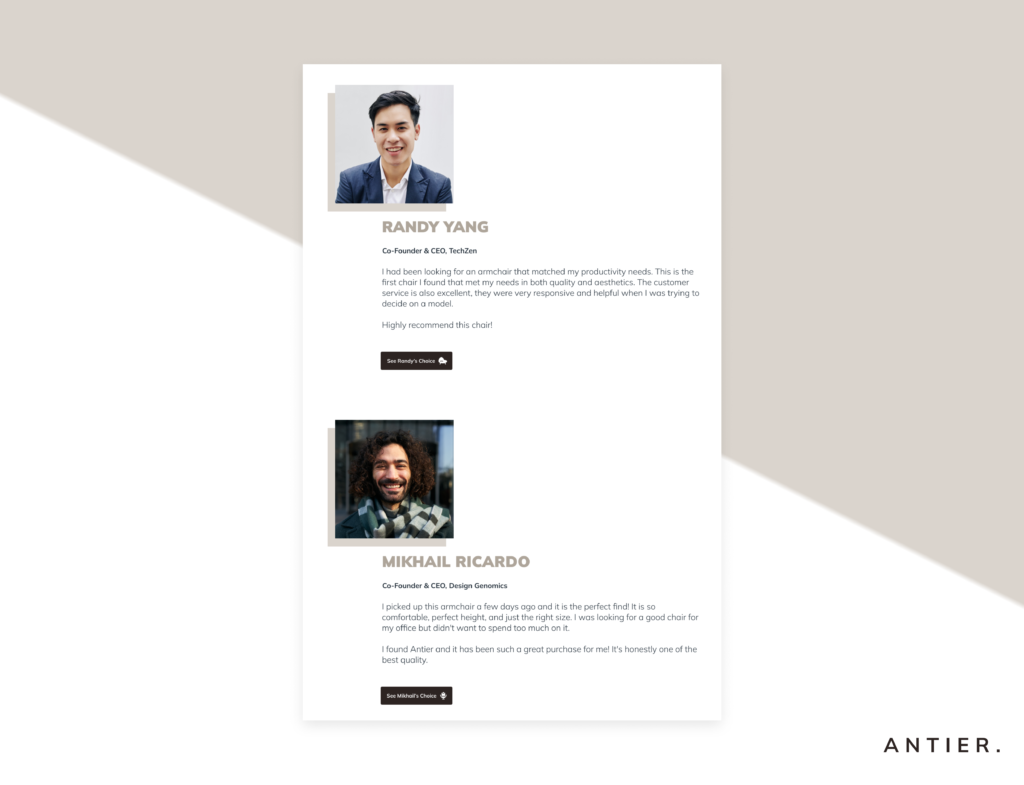
Instead of using the word “testimonials” I prefer the word “story”, the reason for using the word is because everyone likes stories, either about their own lives or about other things. In addition, I prefer to display Antier customer feedback in the form of short stories because stories can change someone’s thoughts and feelings about something.
Antier Customer Stories, Dent Difa
I want customers’ positive views about Antier’s products to touch the hearts and minds of new users later, through the influence of the short story that is displayed. Because I want to convey the value of Antier to its users that Antier is a chair brand that is focused on productivity, and efficiency and is made to make life easier for its users. So that their stigma towards work chairs is not always about work, but comfort for a longer time.
Vertical Scroll Customer’s Stories (Reason)
I was inspired by a website called Flux Academy for the placement of the website structure in this social proof section, I prefer to show stories from several customers made vertically scrolling rather than using a slider.
Antier Vertical Scroll Customer Stories, Dent Difa
Because that way I can make sure that when Antier users see the whole page of Antier, they will definitely read the best customer stories that I have selected previously and are displayed in the customer stories section.

